
EXPEDIA
MOROCCO 360
Travel and Editorial Campaign
One destination. Three distinct points of view.
A destination experienced through culture, movement, place, and possibility.
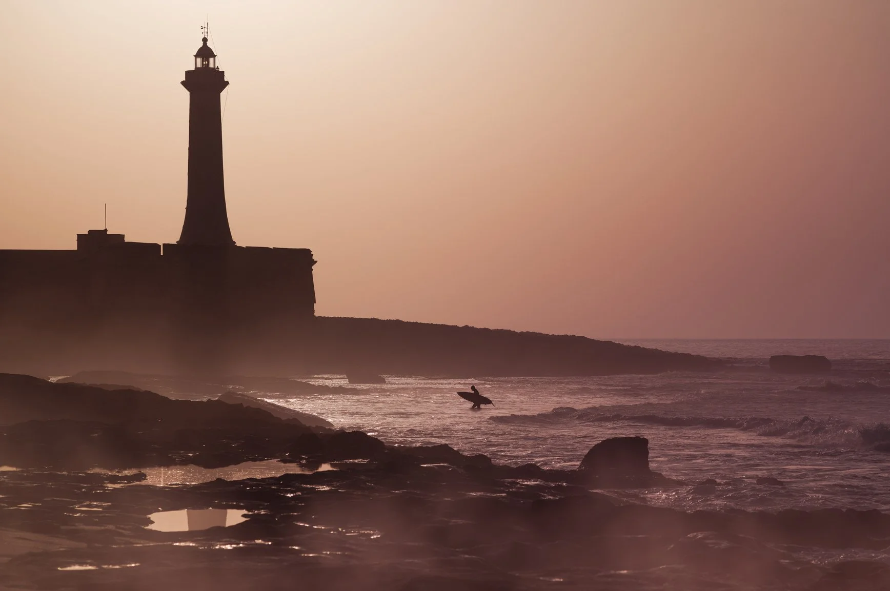
Morocco 360 translated the country’s atmosphere into a cinematic editorial campaign for audiences in the United States, the United Kingdom, and France.
Working within Expedia E Studio, I helped establish the editorial direction and digital design system across the campaign’s localized experiences.
My work included shaping homepage and article structures, defining typography and page rhythm, sequencing imagery, adapting layouts across languages, designing responsive experiences, and maintaining visual consistency across the growing campaign ecosystem.
The result was one connected campaign world with enough flexibility
to feel distinct across three international markets.
PROJECT DETAILS
Client: Expedia, Creative Team, Expedia E Studio
My Role: Senior Designer, Art Direction and Editorial Systems
Markets: United States, United Kingdom, France
Disciplines: Art Direction, Editorial Design, Image Direction, Localization, Responsive Design, Visual Systems
Live Site
ONE CAMPAIGN, THREE WAYS IN
The central challenge was not simply translating one page into three languages. Each market needed to belong to the same Morocco 360 world while responding to differences in language, imagery, content emphasis, and editorial rhythm.
The system needed consistency without sameness.
THE CENTRAL CREATIVE IDEA
The experience was conceived as an unfolding editorial journey.
Photography creates the emotional entrance. Typography and hierarchy provide orientation. Modular sections introduce culture, stories, itineraries, and places to stay, as well as practical travel decisions, without breaking the discovery atmosphere.
The sequence became a simple design principle:
The image draws the traveler in.
Story creates a connection.
Place gives the experience meaning.
Possibility opens the journey.
Action makes it tangible.
Image.
Story.
Place.
Possibility.
Action.
From atmosphere to action
The homepage needed to make Morocco feel immediate while remaining clear, useful,
and distinctly Expedia.
Large-scale photography established warmth, texture, and place. Typographic contrast created a visible content hierarchy. Changes in density and scale produced moments of immersion, information, pause, and movement.
Rather than treating every message equally, the page guided travelers through a deliberate progression from destination desire to practical exploration.
HOMEPAGE SYSTEM
A flexible editorial architecture allowed the campaign to grow without losing its visual rhythm.
The system is balanced:
Immersion and orientation
Editorial storytelling and travel utility
Campaign expression and Expedia functionality
Consistency and market flexibility
A story within the story
48 Hours in Marrakech
The featured Marrakech experience extended the campaign from destination introduction into long-form travel storytelling.
Part editorial feature, part itinerary, and part booking path, the page moved between cultural observation, photography, recommendations, structured information, and places to stay.
The design needed to keep the reader inside the story while making every next step understandable.
Useful without breaking the destination’s spell.
The rhythm of discovery
The article moved through four recurring modes.
Each had a distinct purpose, but all belonged to the same editorial language.
Editorial writing introduced the destination’s culture, character, and lived experience.
STORY
Photography created emotional pauses and brought texture, scale, and human detail into the narrative.
IMAGE
ITINERARY
Structured recommendations helped travelers move from inspiration into planning.
Travel options connected the editorial journey back to Expedia’s platform.
STAY
PHOTOGRAPHY AS STRUCTURE
Photography was not the decoration. It was the narrative.
Photography carried much of the campaign’s
emotional weight.
My image-direction contribution focused on how photographs were selected, cropped, scaled, sequenced, and placed throughout the experience.
Wide environmental scenes establish a place. Closer observations created intimacy. Changes in scale controlled pace. Moments of visual abundance were balanced by quieter compositions that allowed information and action to come forward.
The relationship between image and typography helped the campaign feel cinematic without becoming uncontrolled.
One visual language.
Three expressions.
Typography, spacing, image behavior, scale, and modular page structures formed the shared language of Morocco 360.
Within that structure, each market version could adjust its wording, imagery, content emphasis, and pacing.
The intention was never to create three identical experiences. It was to create three related expressions of one campaign idea.
Localization became part of the creative system rather than a final production step.
Built to
travel across screens
The campaign was designed across desktop and mobile from the beginning.
Responsive decisions protected the experience rather than merely reducing it. Images were reframed, typography was recalibrated, dense sections were simplified, and content sequences were adjusted to preserve the narrative.
The mobile experience retained the atmosphere of the desktop campaign while giving travelers a clear path through stories, information, and booking opportunities.
A system, not a single page
Morocco 360 was built as a flexible editorial system capable of carrying one campaign identity across multiple markets, devices, stories, and audience needs.
Reusable structures supported localized homepage hubs, long-form editorial experiences, different language lengths, varied image formats, travel-planning content, and later campaign extensions.
The system created enough structure to remain recognizable while allowing individual stories and market versions to develop their own rhythm.
Consistency gave the campaign a recognizable world.
Flexibility allowed that world to keep expanding.
One destination world, built to move across markets.
Morocco 360 delivered a unified destination experience for three international audiences while allowing each market expression to retain its own character.
The final system connected cinematic imagery, editorial storytelling, localization, responsive design, and travel utility into a single coherent visual language.
The project demonstrates the role design can play beyond individual screens: establishing a world, creating the rules that hold it together, and building enough flexibility for that world to travel.
capracare
A long-term creative partnership spanning identity, digital design, documentary photography, and community-health storytelling.